We built a better way to research assets
Here’s why we decided to rethink investment screening.


Dan Muse
November 28th, 2022

Blog | We built a better way to research assets
tl;dr
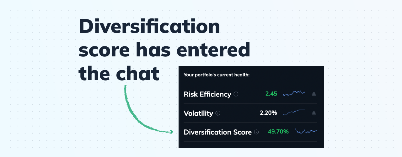
We built new research pages for 40,000 symbols in our database. See at a glance:
Risk Efficiency. How well is it trading risk for reward?
Volatility. How risky would it be to own?
Growth, compared to all major market benchmarks
The perfect research tool didn't exist, so we built it.
From the jump, we created Finiac to help individual investors build better portfolios.
So, naturally, we started with a killer portfolio-building experience:
At-a-glance risk analysis? Check.
Correlation finder? In the box.
Volatility-weighted position sizing? Done.
But as we used the tool ourselves, we realized pretty quickly that we missed a step. You can’t build a portfolio until you’ve done your research.
That’s how we decided to build a truly killer asset research tool.
Introducing Finiac Asset Detail Pages
Here’s what you’ll find on the new pages:
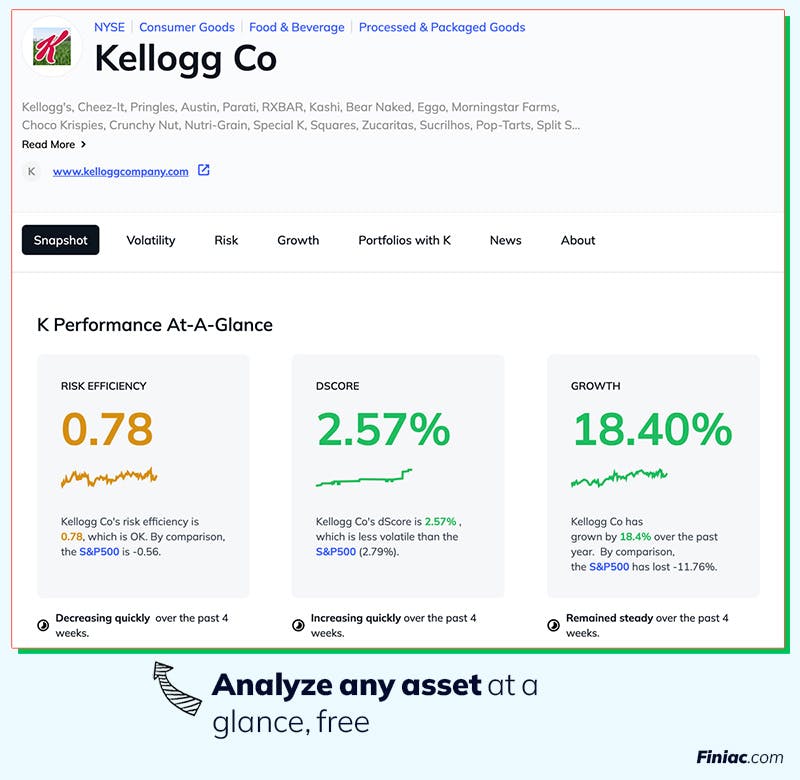
Top-line stats, always at a glance
Most research tools and stock screeners have you drowning in data. Table after table of stats. We’re humans. We want to see the most important numbers first.
Here’s the Snapshot page for Kellogg Co. ($K):


Right up top, we’re telling you:
Risk Efficiency: How well this asset is trading risk for reward
dScore: what the worst day in an average month will look like
Immediately, you’ve got a solid idea of what owning this asset would be like.
Volatility is key
Most research tools focus heavily on an asset’s price, day by day.
We believe volatility—how much that price is moving up or down—is way more important. It’s a much better metric, for example, if you want to know how well it might fit in your existing portfolio.
Here’s the volatility analysis for the same ticker:
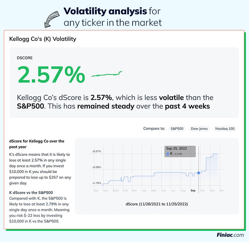
In the screenshot above, you can see that Kellogg’s dScore has risen quite a bit over the past few months. This means it’s getting more risky to own, something most investors would love to know!
Spotlight on Risk Efficiency
Time to dig deeper with RE, which tells you how well the asset is trading risk for reward.
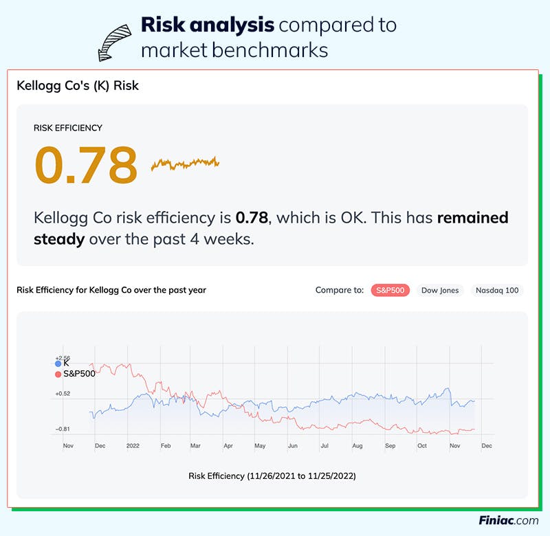
So, Kellogg’s risk efficiency has dropped steadily over the past year. This, combined with dScore, can help you decide whether or not the increased amount of risk you have to take to invest in Kellogg is worth it to you or not.
Risk Efficiency is still a pretty new concept, so we tell your right up top how well the asset is doing in that regard.
The chart allows you to compare it to market benchmarks. For example, above, you can see that in late February 2022, $K became more risk-efficient than the S&P 500.
How we look at growth
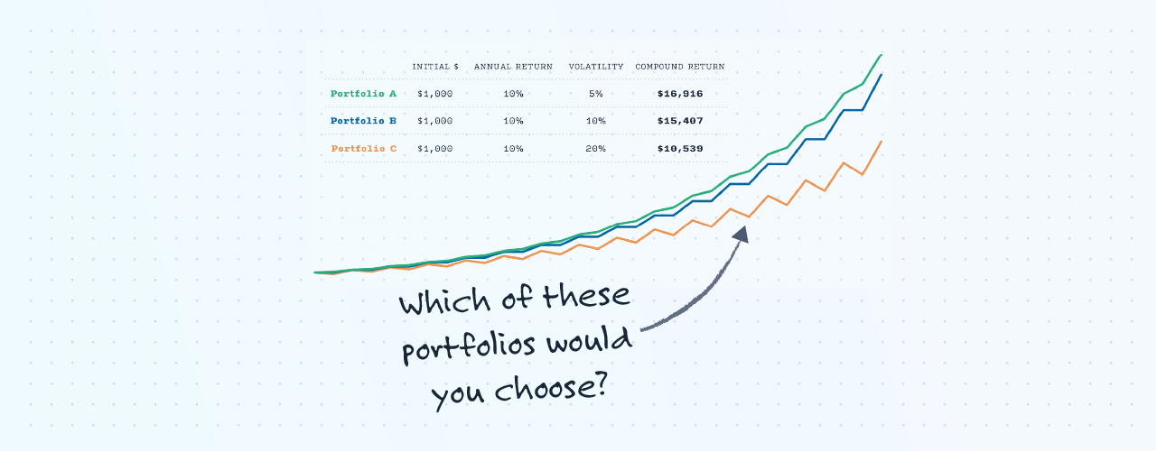
This is everyone’s favorite stat, isn’t it? We get it: we love to see that movement up and to the right.
But we wanted to make those numbers a little more real. Check out the text next to the graph below:
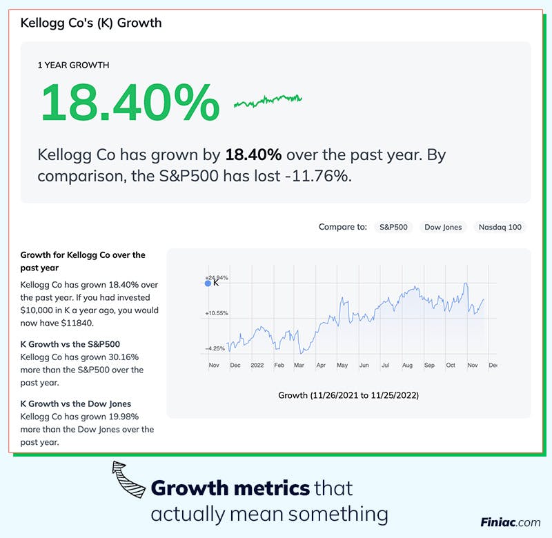
Rather than just giving you the one number, we decided to give you context:
What would a $10,000 investment have earned me in the past year?
How did this ticker do, compared to the S&P500?
How about compared to NASDAQ?
To finish our quick analysis on Kellogg with these pages, you can see that if you would have invested $10k in Kellogg a year ago, you’d have made $1,184 on that trade. And, to invest in it for the future, you’ll need to be willing to risk around $280 at any given time, since that’s what it could be down at any point in a month
Browse public portfolios
After covering all the major performance stats, we wanted a bit of a wider view.
First, we added a news page, so you can see all the latest coverage of that symbol.
But we realized what we really want: to see how other folks are choosing to invest in the asset. That’s where the Portfolios page comes in:

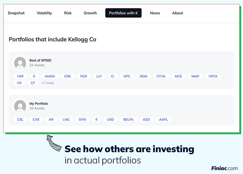
Here, we’ll list any public Finiac portfolio that contains the symbol you’re looking at.
Because no asset stands alone. Each investment needs to play nicely with everything else in your portfolio.
Start exploring now!
We just deployed asset detail pages for every symbol in our database, which means we’ve now got 40,000 new pages for you to explore.
Try it with any ticker, in this format: finiac.com/symbols/[ticker].
A few to get you started:
Don't fall prey to loss aversion
Design better portfolios with RiskSmith


Risk Efficiency - A metric that tells you how well an asset is trading risk for reward. The number is closely related to the Sortino Ratio. Risk Efficiency can be calculated for any asset—a stock, an ETF, a portfolio, and more.
dScore - A metric describing the amount you can expect to lose on an investment on your worst day in an average month. Equal to an asset’s 95% value-at-risk.
Other posts that mention terms Risk Efficiency dScore


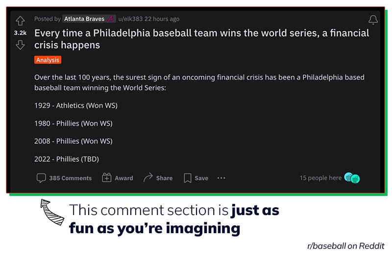
Analyzing a Portfolio from Reddit


Dr. Richard Smith

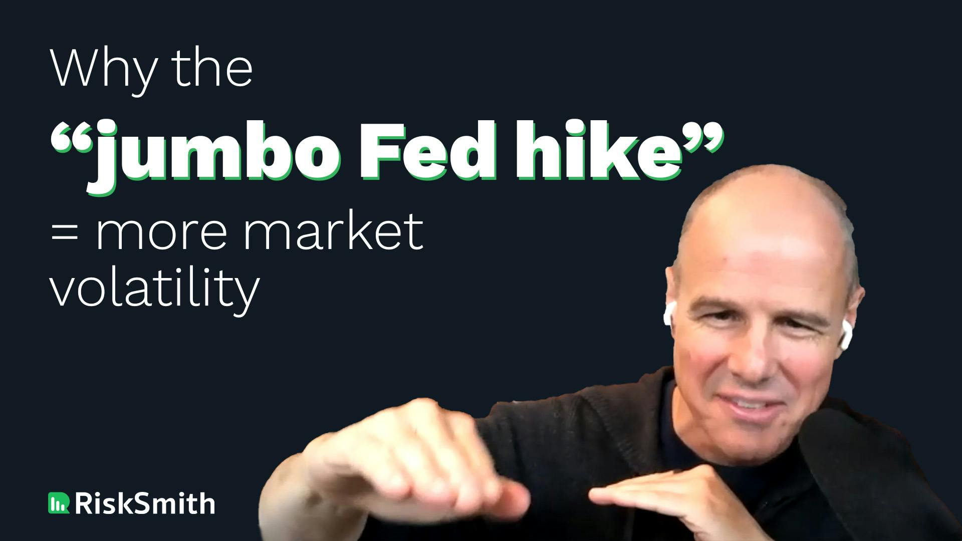
Why you should care about volatility
Dr. Richard Smith
Why you should care about volatility
Dr. Richard Smith

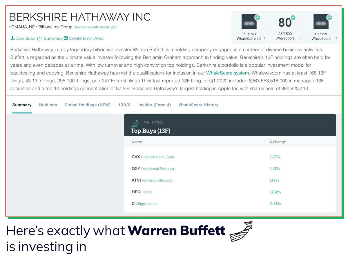
5 Questions to Ask Before Buying a Stock

Justin Davis
Related Posts